大境和觀
TOPOSITION Construction Office
Interior / Office
TOPOSITION Construction Office
作品介紹
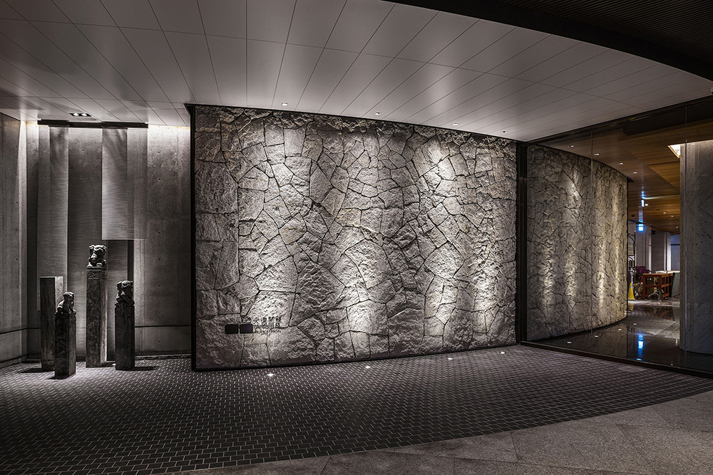
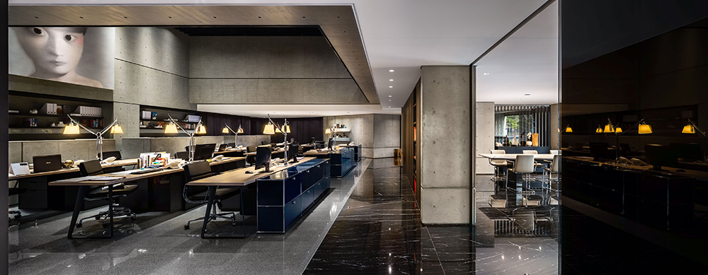
基地是附屬在母公司建築外側的辦公空間,希望空間與建築物產生更多的對話性,因此在設計入口處時創造了一道弧形的牆面串連兩空間的關係,新入口改變了方向,原玻璃牆變成了彎曲的石牆,減少了外部干擾。通過使用石材從室外延伸到室內空間去營造空間之間的連結。
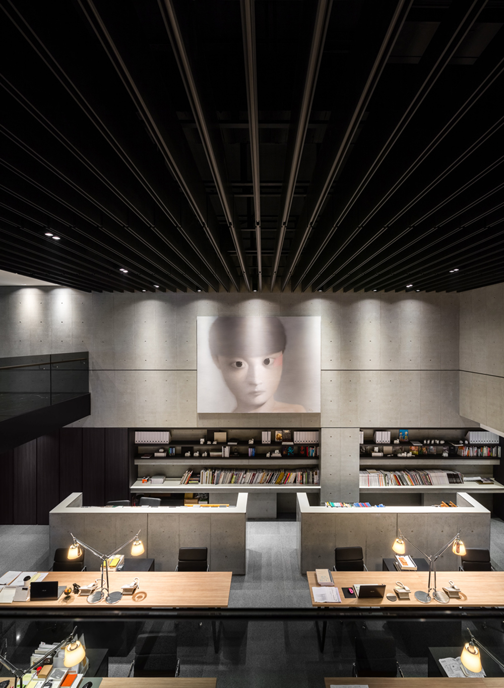
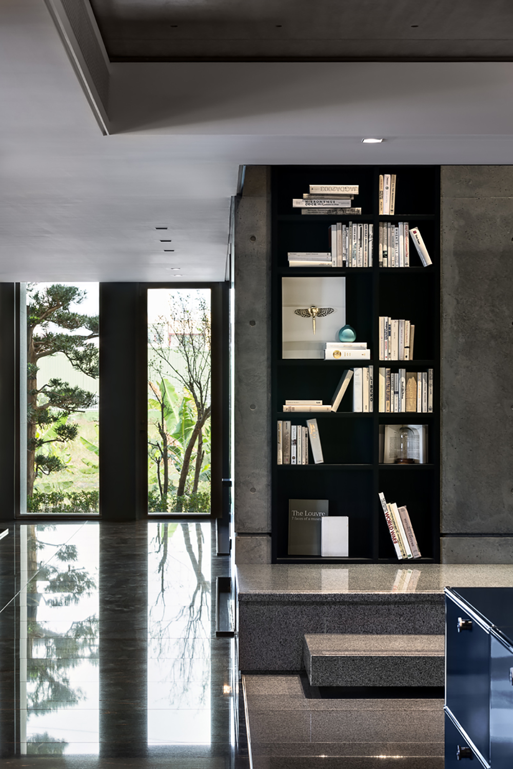
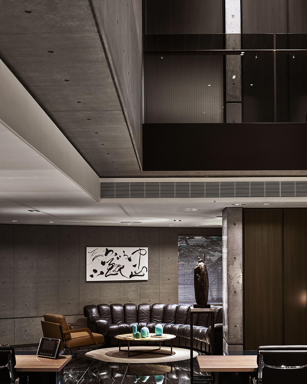
入口改為側面進入的動線,我們將挑空空間移至辦公區,讓入口只有一個樓層的高度,視覺從收斂轉而開闊。進入室內即被終點的自然光所吸引,形成一道無形的動線指引,將原本封閉的牆壁打通設置落地窗,並在外面種植樹木引入綠意與天光,使環境更舒適。
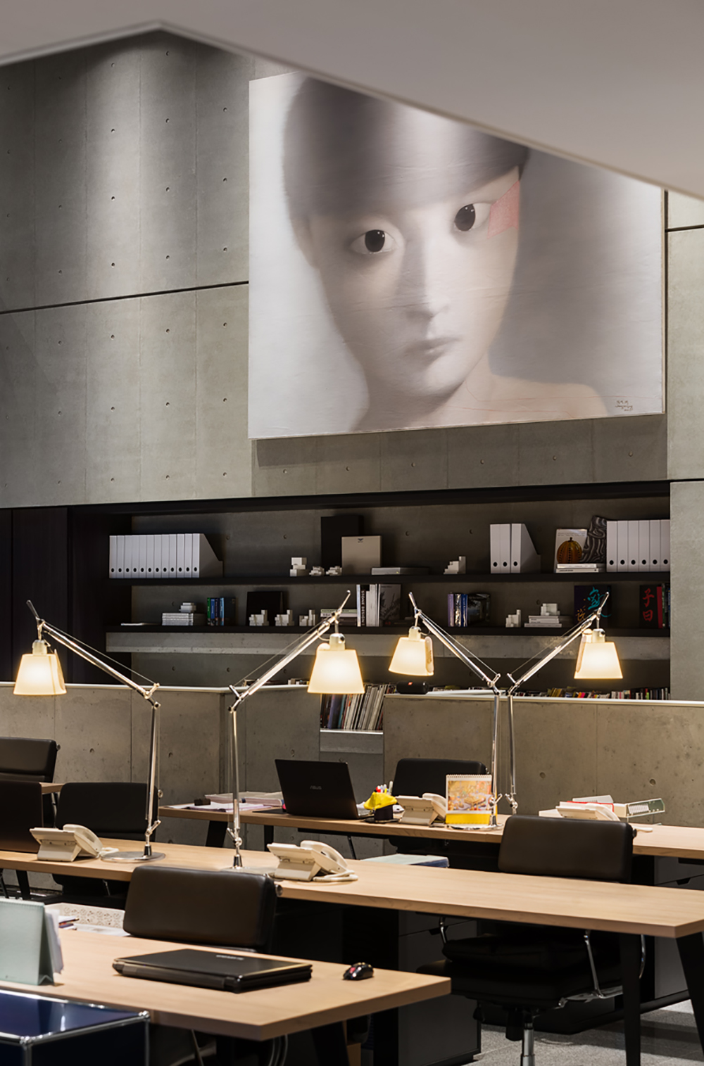
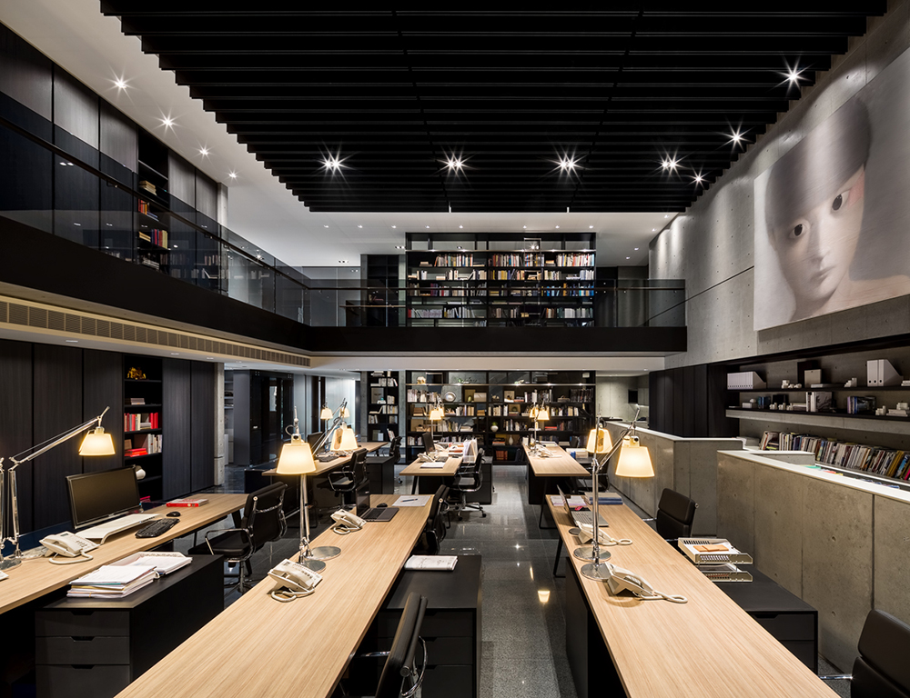
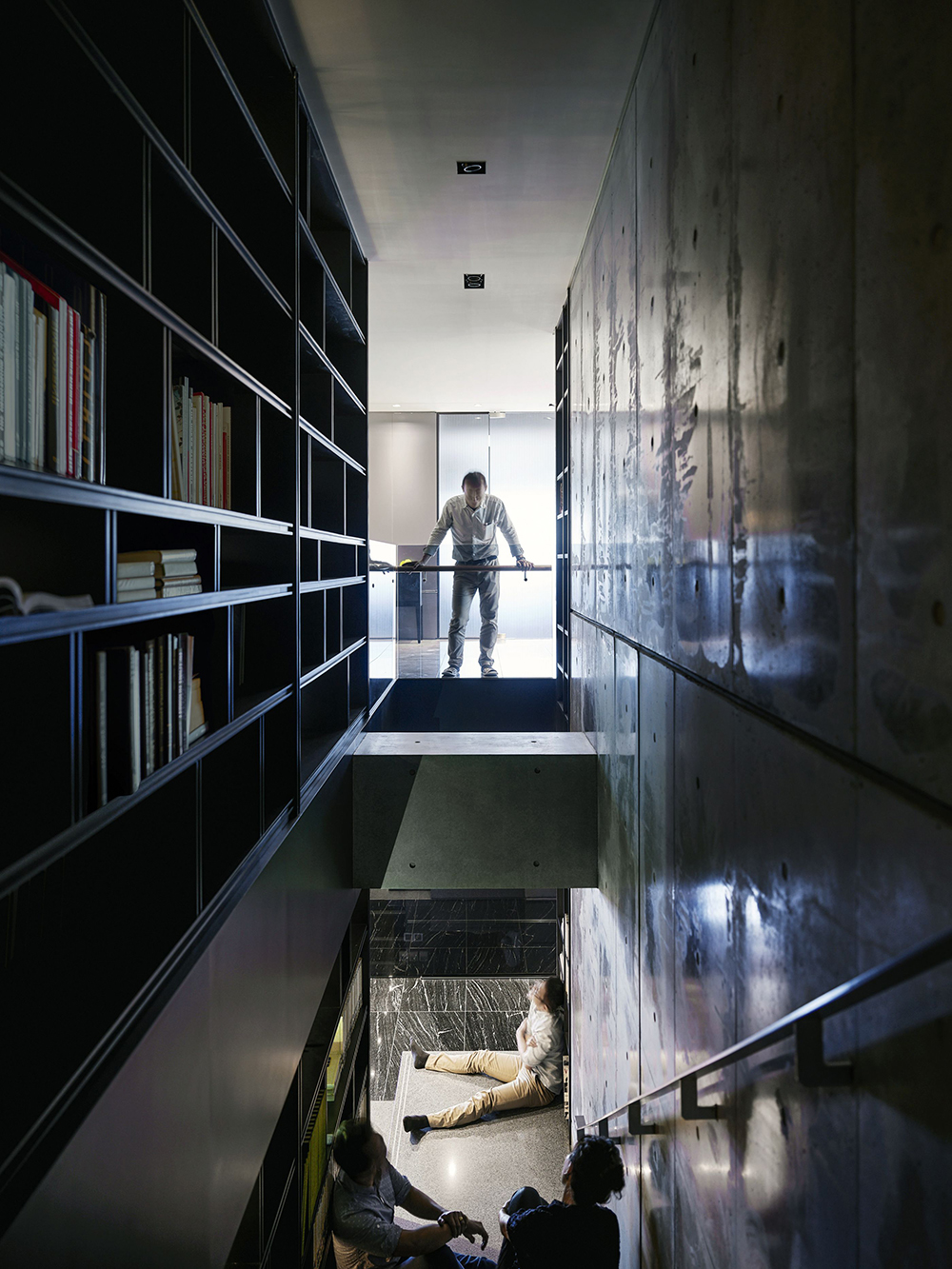
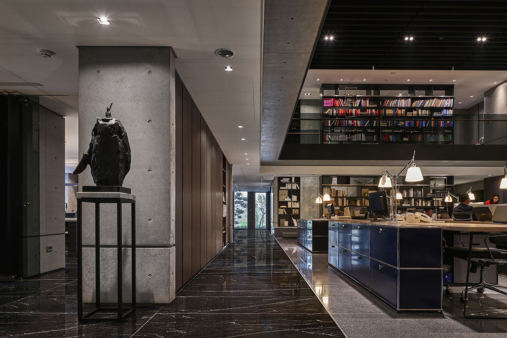
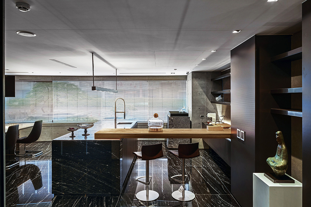
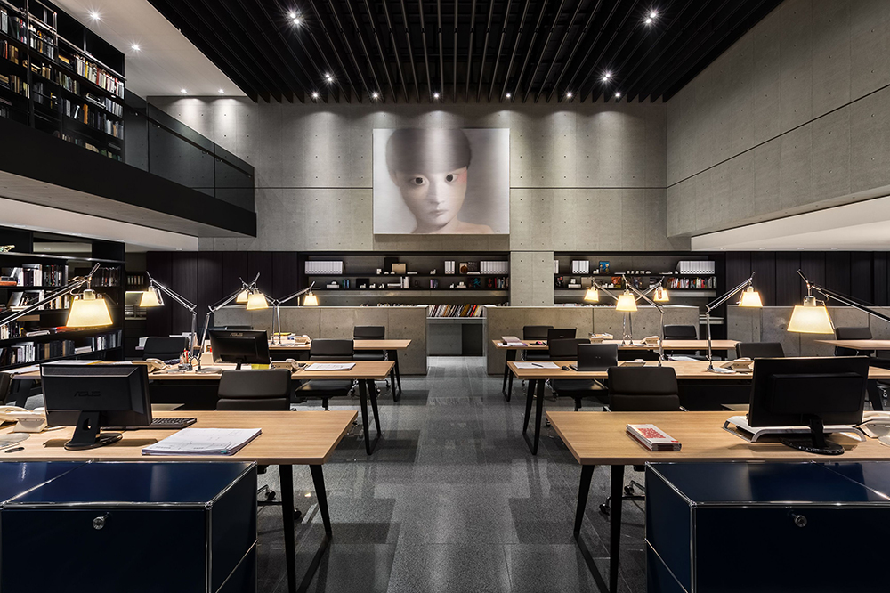
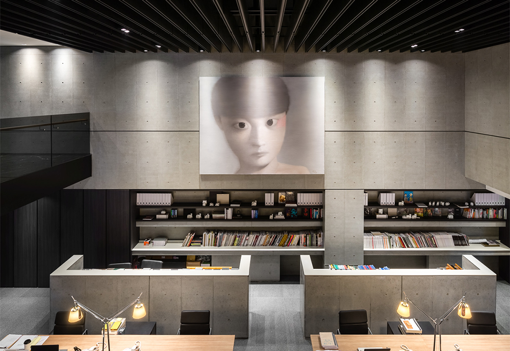
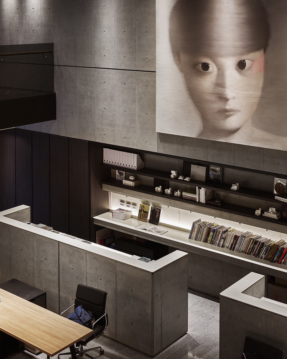
工作區後方設置了建材展示區與選樣區,提供使用者收納建材與討論的空間,在該區設計上亦延續了清水模的元素,期待在空間中使用最少的材料,創造空間的延續感。空間透過連接上下書櫃,增加兩層樓之間的關聯性,創造連續性的感受。樓梯則扶牆而上,踏階以植筋的方式輕觸於牆面,呈現出輕巧的視覺感,讓每一階獨立的踏階就像是漂浮在空間中,利用書櫃牆降低對工作區的干擾,使工作區域更加穩定。
Description
The architecture is an office near outside of the headquarters, the design hope to create more coordination between space and architecture. The curved wall at the entrance is created to connect the office and headquarters, by using stone materials to extend interior space from outdoors and can reduce the external interference. The new stone wall extends the original arc of the building.
The side entrance breaks the original pattern, we transform the office area into an atrium, so that there is only a difference of one floor, you will first see the ground level before the second level. The space converges and then open. After entering the room, you are drawn to the natural light which creates a path from start to finish. Open the originally closed walls and set the French windows to create a comfortable environment for people to appreciate nature.
The display areas of building materials and samples are set behind the working area to provide users a place to collect and discuss. The usage of exposed form element is continued to minimize the use of materials and create the continuation of space. The bookcase is used to make sense of the flow between floors. By combining the upper and lower bookcase, the connection between the two floors is increased. The steps are planted on the wall and present light visual sense to make every single step like floating in space. We use the bookcase to reduce disruption to making the work area more stable.
